![]() Apidae is
a cloud-based computational engine specifically written with the needs of high-performance simulation of energy models of buildings in mind.
Users can interact with Apidae by using a regular browser (no additional software needs to be installed) or integrate Apidae into their own software by using a powerful application programming interface (API).
Apidae is
a cloud-based computational engine specifically written with the needs of high-performance simulation of energy models of buildings in mind.
Users can interact with Apidae by using a regular browser (no additional software needs to be installed) or integrate Apidae into their own software by using a powerful application programming interface (API).
The system allows the users to access a variety of energy simulators, but it works especially well with EnergyPlus, which was funded by the the U.S. Department of Energy. EnergyPlus reads and generates human readable text files. The input is typically one file that describes all the elements of a building that are relevant to an energy simulation (IDF file) and another file that describes the weather conditions of the building over the course of a year (EPW file). The output are reports stored in multiple tables or time series data as comma separated values (CSV). Even though EnergyPlus is an excellent simulator for single simulations and has a high accuracy, it can be rather slow (a complex model can take several hours). It has also only limited capabilities to parallelize the computation or to handle multiple variations of a building. We created Apidae to fill this gap.
Apidae has flexible system that allows for the parameterization an existing energy model of a building. In a preprocess Apidae extracts all possible parameters and all possible outputs of the model. The users can narrow the selection down to the parameters and outputs that are important to them. After that the parameters can be set to new values to generate variations of the same model (like different insulation values), start the simulation of this “new ” building on the cloud, and collect the results.
We use Amazon Web Services which allows us to easily start up thousands of instances. We have special worker instances that have everything installed to run energy simulations and statistical processing of the simulation output. Each worker has a variety of EnergyPlus versions which allows the users to explore older models. We also have higher level manager instances that allow running of certain algorithms, like sensitivity analysis, grid simulation, particle swarm search, and so on. These managers do not run simulations, but queue them up for workers to process. There are also job queues for managers which means the system is very flexible to any load changes.
We use multiple database systems, like MongoDB for user data, Redis for queuing and process communication, and PostgreSQL for simulation metadata and high-level results storage. Time series data is stored on Amzon's Simple Storage Service (S3)
I worked a lot on the processing of the simulation output and the visualizations. Energy simulations can create a vast amount of data and finding the right data, especially when simulating hundreds of variations of a model, can be difficult. Before, when I worked on the Sustain Framework, we converted the outputs to surface colors directly in the 3D model and used a 2D time scrubber control to change the colors over the course of a day or year. While this certainly looks great, it is actually pretty difficult to get a meaningful understanding of the data. Furthermore, many energy models do not have all the 3D data, so this approach does not always work well.
For Apidae we decided to go back to using charts to visualize data, but to make them interactive. No additional software needs to be installed, because we use regular html, JavaScript, and the wonderful D3.js library. This interactive method allows the users to playfully explore the data and find interpretations much faster. You can find a good summary of different chart types here.
We created four modules (Accelerator, Influence, Factors, and Calibrator) that focus on tasks that have been traditionally either very difficult or almost impossible to do for many practitioners in the field.
Accelerator
Accelerator allows the users to simulate a model very fast. The model will be processed on 12 cloud instances and each instance does only one month. At the end the results are stitched back together and the results are very close to the results that the users would have gotten, if they ran it on only one instance for the full year.
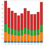
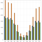
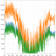
Monthly data is very compact, since a whole year has only 12 values. A grouped bar chart is perfect to visualize the total values of the simulation outputs and a stacked bar chart is great to compare the sum. When comparing the outputs from multiple simulations only a grouped bar chart makes sense.
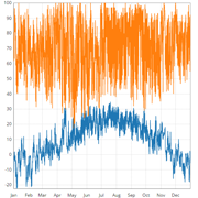
Hourly data creates 8760 values for one year, which is much more data than a typical screen has pixels. The hourly mode is a line chart that allows you to zoom (use the mouse scroll wheel to zoom and the left or center mouse button to pan). The daily mode aggregates the data with the line being the average and the band being the minimum/maximum range in 24 hours.
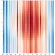
Another way to visualize the data is a heat map. The values are color coded and the x axis is the day and the y axis is the time of the day. Heat maps easily illustrate seasonal changes and trends, but are not good for judging absolute values.
Influence
Influence allows the users to parameterize the energy model, like wall insulation thickness, window insulation factor, and roof insulation thickness. It also allows the users to specify which outputs of the simulations are important to them. After that they can start a sensitivity analysis (we use MOAT) to determine, which parameters have a strong impact on the outputs and which do not.
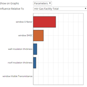
The result of the sensitivity analysis is a 2D array of the influence of each parameter on each output. A very intuative way of presenting the influence is a horizontal bar chart and graphing on slice, either along the parameter axis or the output axis. The users can choose what slice they want to visualize - typically they would show the parameters on the graph and would choose an output in the seconds drop down menu.
Factors
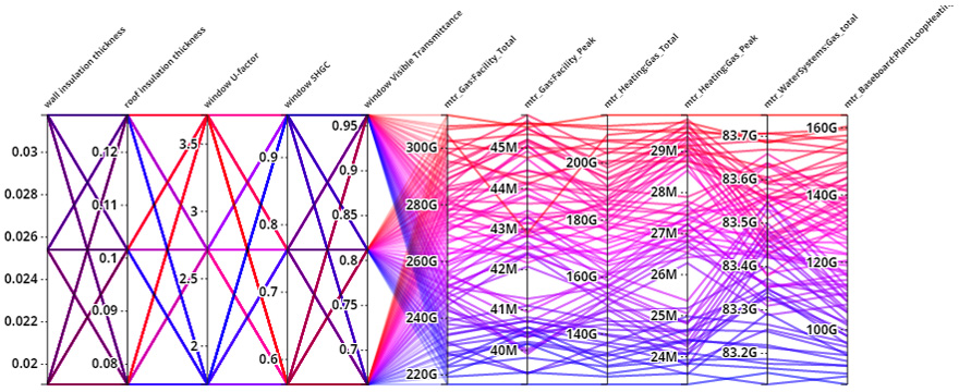
Factors is very similar to Influence and it allows the user to define parameters and outputs. Each parameter gets a minimum / maximum value and a number of steps. The system will create a simulation for each of value of the Cartesian product of the parameters (a full grid simulation). The number of simulation can potenially be pretty high, but this gives you a full understanding of the model variations.
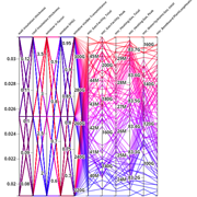
To visualize the data we use parallel coordinate charts. The parallel axes are the parameters on the left and outputs on the right. Each polyline represents one simulation by intersecting the each axis by the value of that parameter or output. The users can select a subset of the data by drawing a filter on an axis (left-click and dragging) which will be highlighted. The position of the filter can be changed by dragging the new highlighted area. Multiple filters can be applied and a filter can be deleted by clicking on the axis anywhere outside of the filters area.
Below the chart is a list of the parameters and outputs. You can turn an axis on or off with the checkboxes in the column and change which one is used for line colors with the radio buttons in the column.
Calibrator
Calibrator allows the user to find a building where the a choosen simulation output is very similar to some measured data, like electricity consumption to the utility bill. Similar to Influence and Factors the users to define parameters and outputs, but additionally the upload measured data and align certain columns in the measured data with simulation outputs. A search algorithm iterates through parameter variations and finds good matches.
The visualizations used here have been already explained - monthly data, hourly data, and parallel coordinate charts.