EasyGraph
A small, batteries-included charting library built on D3 v7: lines, min/max ribbon bands, stacked areas, zoom, a hover crosshair, stacked/grouped bars (vertical and horizontal), heatmaps, and scatter plots, with chart width that tracks its container's rendered size. It powers the charts across this site's Weather, Sensors, EnergyPlus Weather, and Graphics sections.
Source, docs, and license: github.com/larsi-org/d3-easygraph. ☕ If you find it useful, consider sponsoring.
Core
Shared by every chart below: container sizing that tracks a live resize (width follows the
container, height stays fixed), SVG/margin/clip/title scaffolding, palette handling, number and
time axis formatting, and a small set of unit presets (temperature, pressure, wind speed, and so
on) that fill in a sensible label/unit when you just want to plot a known physical quantity. A
chart's title is optional too - with no preset and no label of your own, it just
renders blank. Presets deliberately don't supply a range - what's a sensible axis
range depends on the data (what a given station or sensor actually observes), not on the physical
quantity itself, so a chart with no range of its own just auto-scales from whatever
data is currently loaded. Any x/y/color config also accepts
clip: [loQuantile, hiQuantile] - when that property's domain is data-driven, it's
built from those quantiles instead of the true min/max, so one extreme outlier doesn't stretch the
whole scale so far that everything else compresses into one end of it (see
Weather's "Pressure & Wind" tab, whose color scale clips to the 5th/95th
percentile for exactly this reason).
Each constructor returns the chart object - work with that, not with the config you
passed in. The config (and its x/y/color/
margin sub-objects) is cloned on the way in, so one config literal can safely build
several charts and none of them can corrupt another. graph.update(data, ranges)
re-renders and returns the graph, so calls chain; ranges: { x, y } optionally pins
either axis domain instead of auto-fitting to the data. Every chart's <svg>
carries class="easygraph" (which the whole stylesheet is scoped under, so it can't
restyle the surrounding page) plus role="img" and an aria-label
mirroring the chart title.
Units
The same preset table a chart's x/y/color preset
resolves against is also available standalone, with no chart or container involved - handy for
e.g. converting a raw value before coloring or labeling a map marker.
d3.easygraph.getUnit("temperatureF");
// => { label: "Temperature", unit: "°F", scale: "linear", convert: f(v, d) }

d3.easygraph.getUnit("temperatureF").convert(20);      // => 68   (20°C to °F)
d3.easygraph.getUnit("temperatureF").convert(20.44, 1); // => 68.8 (rounded to 1 decimal)
getUnit(name) returns the named preset - a complete, ready-to-use
{ label, unit, scale, convert } - or the generic default entry
(empty unit, linear scale, identity convert) for a falsy or unrecognized name. Every
preset declares its own convert(v); most (e.g. relativeHumidity,
windDirection) just use the identity function since they need no conversion.
convert optionally takes a second argument, convert(v, d), rounding the
result to d decimals via d3.easygraph.round - convert(v)
alone stays unrounded, so a consumer needing full precision isn't forced to lose it.
Colors
The same colorPalette/colorClasses resolution a chart's
paletteColors goes through internally is also available standalone, same shape as
Units above - handy for coloring something that isn't an EasyGraph chart at all, like a Leaflet
marker layer or a d3.parcoords() line, without hand-rolling a separate color scale.
d3.easygraph.resolvePalette("Diverging.RdYlBu");
// => ["#a50026", "#d73027", "#f46d43", ..., "#4575b4", "#313695"]

d3.easygraph.resolvePalette("Diverging.RdYlBu.reversed");  // same colors, reversed order
d3.easygraph.resolvePalette("Sequential.Blues", 4);         // the 4-class Blues, not its largest class count

d3.easygraph.colorScale("Diverging.RdYlBu.reversed", [dataMin, dataMax]);
// => a ready d3.scaleLinear, clamped, with RdYlBu's colors (reversed) spread evenly across the domain

d3.easygraph.colorScale("Sequential.Blues", [dataMin, dataMax], { classes: 4, quantize: true });
// => a d3.scaleQuantize instead - 4 discrete, equal-width bands rather than a continuous gradient

d3.easygraph.resolvePalette("Sequential.Turbo", 256);
// => 256 colors sampled from d3.interpolateTurbo - works for any scheme that only ships as a
//    continuous interpolator function, no discrete d3.schemeX array, the same way as above
resolvePalette(name, classes) resolves a colorPalette name - every
name is Kind.Name: Sequential.* (a plain value gradient),
Diverging.* (a gradient with a meaningful midpoint), or Qualitative.*
(unordered, mutually distinct categories - this is where D3's own Tableau10 (the
default), Observable10, and Category20/20b/20c,
plus a handful of hand-picked extras, all live too) - to a plain color array, the same
resolution paletteColors goes through internally, down to the
.reversed suffix and colorClasses class-count override.
colorScale(name, domain, options) builds on that: a ready color(value)
scale spanning the resolved palette across [min, max], clamped so an out-of-range
value still draws as the nearest end color rather than extrapolating past the palette - exactly
what Heatmap and Scatter build for their own color.$scale, just for a caller with
its own already-known domain instead of one computed fresh from live chart data every render.
d3.easygraph.colorPalettes (the full resolved {name: [colors]}
map both functions read from) is public too, for listing every available palette name - try any of
them below.
Almost every palette here is an externally designed and tested scheme:
ColorBrewer's sequential, diverging and qualitative sets (Blues,
RdYlBu, Set1, …), plus Tableau's
Tableau10 (the default), Observable's Observable10,
Google's Turbo, and D3's own
Category20/20b/20c - those last three are written out
by hand here only because D3 dropped them from d3-scale-chromatic in v5, not
because they're any less standard.
The six names carrying an LS- marker are the exception: hand-picked for one
specific page on this site rather than researched for general use, so pick them knowing that.
Qualitative.LS-RdGnBu/LS-SunArc color a small number of visually
distinct line series (e.g. Sunrise/Sunset's
sunrise/noon/sunset trio); Qualitative.LS-SustainZones colors named model zones;
Diverging.LS-BuMaRd/LS-BuCyGnYlRd were alternatives tried on one
heatmap; Sequential.LS-Gy is a plain black-to-white ramp. Some schemes - currently
just Sequential.Turbo - only ship as a continuous d3.interpolateX(t)
function rather than a discrete d3.schemeX array; resolvePalette/
colorScale resolve those by name too, sampled at 9 evenly-spaced points by default or
at classes points when you ask for a specific count, exactly like a colorbrewer
scheme's classes override above. Live examples elsewhere on the site:
Weather's Comfort-tab map markers
(colorScale("Diverging.RdYlBu", [sensor.max, sensor.min]), hot=red/cold=blue),
Apidae's Data Grid
(colorScale("Diverging.LS-BuMaRd", extent) for its parcoords line color) - both used to
hand-roll their own scale before switching over - and
Lorenz Attractor's "color by time"
(resolvePalette("Sequential.Turbo", 256), sampled directly rather than built into a
scale since a discrete count-sized array, not a color(value) function, is what its
point-cloud renderer wants).
Named after Cynthia Brewer's Color Brewer 2.0, the origin of most of these schemes (see the Colors section above for the rest).
resolvePalette/colorScale are both name-based lookups. For a caller
that instead needs an arbitrary, caller-chosen count of colors with no natural name (a
polygon's side count, an IFS's transform count), hueWheelPalette(count) generates
one instead of looking one up:
d3.easygraph.hueWheelPalette(5);
// => [[217,38,38], [181,217,38], [38,217,110], [38,110,217], [181,38,217]] - 5 evenly-spaced hues
Evenly spaced hues around the color wheel, for unordered categorical data (a vertex id, a
transform id) - not the right fit for ordered data, where two adjacent categories landing
on similar hues near the wheel's wraparound would misleadingly suggest they're related; use a
Sequential palette for that instead (see Lorenz Attractor above). Returns
[r, g, b] number triples rather than the CSS-string colors everywhere else on this
page - built for consumers that write colors directly into a Canvas
ImageData buffer, like the point-cloud renderer behind the
IFS/Chaos Game
fractal pages (2D and 3D versions of each), which need the numbers as-is rather than a string to
re-parse.
Line
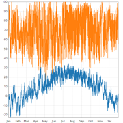
Lines and filled min/max ribbon bands over a continuous (time or linear) x axis, with optional
zoom (scroll to zoom, drag to pan) and a hover crosshair - multiple line charts on the same page
can have their zoom and crosshair synced together. A data point with y: null (or,
for ribbons, min/max: null) breaks the line/ribbon into a separate gap
there instead of drawing a straight segment through the missing value - lets a caller break a
circular quantity (e.g. compass bearing) at its own wraparound point, rather than the line falsely
cutting straight across the chart from 359° to 0°. undefined and a missing
y key mark a gap the same way.
NaN and Infinity are not gaps, and aren't validated.
They pass the gap check and flow into the scale, putting a literal NaN into the
path's d attribute - which browsers refuse to render, usually blanking the whole
series. Infinity is worse: it also enters the domain calculation, so one bad value
stretches the axis to infinity and flattens every valid point with it. Per-point validation would
cost a check on every value of every render, on charts that routinely carry tens of thousands of
points, to catch what is a bug in the calling code - so filter non-finite values out, or convert
them to null, before passing them in.
units gives the crosshair tooltip a different unit string per series (index-matched
to the series arrays passed to update()), for a multi-series chart mixing quantities
where the chart's single shared y preset's unit isn't right for all of them - a series
past the end of units, or with a falsy entry, just falls back to the shared unit.
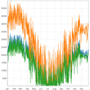
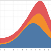
stackedArea: true draws a classic stacked area chart instead - plain
{ x, y } points per series like lines, each series' area stacked
cumulatively on top of the ones before it, rather than ribbons' independent min/max
band per series. The y axis always includes zero, same as Bars' stacked mode, since a stack's
height only means something measured from the bottom. Series need to be sampled at the same x
positions to stack correctly - they're combined by array index, the same assumption Bars' own
stacked mode already makes.
var graph = d3.easygraph.line({
  container: "#graph",
  x:         { scale: "time" },
  y:         { preset: "temperatureC" },
  height:    320,
  margin:    { top: 20, right: 20, bottom: 30, left: 50 },
  lines:     true,
  ribbons:   true,
  zoom:      [1, 50],
  crosshair: true
});

graph.update(graph_data);

// e.g. toggle daily averages (min/max band) on or off, then re-draw
graph.ribbons = false;
graph.update(graph_data);

// e.g. a per-sensor multi-series chart where each series has its own real-world unit,
// rather than the shared y preset's - the crosshair tooltip uses these instead
graph.units = ["°F", "%", "hPa"];
graph.update(multi_sensor_data);

// e.g. switch the same three series from a plain overlapping-lines view to a stacked
// area, showing their combined total as the height of the whole stack
graph.stackedArea = true;
graph.lines = false;
graph.update(multi_sensor_data);
Bars
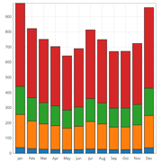
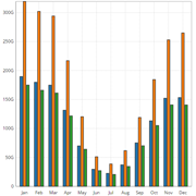
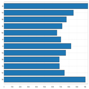
Vertical or horizontal bars, stacked or grouped. Orientation is fixed for a chart's lifetime, but stacked vs. grouped can be toggled live (see the dropdown on the examples below).
var graph = d3.easygraph.bars({
  container:   "#graph",
  height:      520,
  margin:      { top: 10, right: 14, bottom: 30, left: 50 },
  orientation: 'vertical',
  mode:        'grouped'
});

graph.update(graph_data, { x: times });

// live toggle to stacked, then re-draw
graph.mode = 'stacked';
graph.update(graph_data, { x: times });
Heatmap
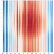
A grid of colored cells over plain continuous x/y axes - good for spotting seasonal patterns
across a lot of data (8,760 hourly values for a year, in the example below) where a line chart
would just be noise. Defaults to colorPalette: "Diverging.RdBu.reversed" rather than
Line/Bars/Scatter's shared Qualitative.Tableau10 - a set of unrelated categorical
hues doesn't make sense spread across a heatmap's continuous gradient the way it does as
per-series colors; override colorPalette in config the same way any chart does for a
different scale.
var graph = d3.easygraph.heatmap({
  container: "#graph",
  x:         { scale: "time" },
  height:    520,
  margin:    { top: 10, right: 14, bottom: 30, left: 50 }
});

graph.update(graph_data, { x: [ startDate, endDate ], y: [ 0, 24 ] });

// switch to a different data channel, then re-draw
graph.update(otherGraphData, { x: [ startDate, endDate ], y: [ 0, 24 ] });
Scatter
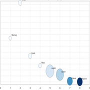
Colored circles at arbitrary { x, y, value } points over plain continuous x/y
axes, colored the same way as Heatmap's cells - a preset/palette-resolved color
scale. No geography built in: to overlay points on a map, project each point's lat/lng to pixel
x/y yourself (e.g. with d3.geoAlbersUsa()), draw the base map separately, and hand
scatter the already-projected coordinates - see Weather's
"Pressure & Wind" tab and Air Traffic for live examples.
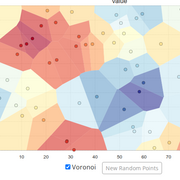
voronoi: true fills the region closer to each point than any other with that point's
own color (d3.Delaunay/.voronoi(), already part of the full d3 bundle)
- semi-transparent by default (voronoiOpacity, 0.6) so a layer
underneath, like that same base map, stays visible through the fill. A fixed color.domain:
[min, max] (e.g. Air Traffic's [0, 40000] for altitude in feet) beats out the
usual data-driven extent/clip, so a given value maps to the same color snapshot to
snapshot instead of shifting as the current data's own spread changes.
arrows: true draws a directional glyph - a shaft plus a small two-line chevron
head - on top of any point that also carries angle (radians) and
magnitude, letting a second, vector-shaped quantity (e.g. wind: speed + direction)
overlay a scalar one (value's own color, e.g. pressure) at the same position. A point
missing either field just renders its circle with no arrow. Length is mapped from
magnitude via arrowMinLength/arrowMaxLength (default
[6, 24]) - that same Weather tab overlays wind this way, capping the magnitude it
feeds in so one bad sensor reading doesn't stretch every other station's arrow down to an
unreadable sliver.
labels: true draws each point's label (a string) offset
above-right of its circle; a point missing it just renders without one. labelMinZoom
(default 1, i.e. always on) hides every label below that zoom factor - Air Traffic passes a
higher one so its ~6,000 aircraft only get labeled with their callsign once the user has zoomed
in past the point where that many labels would be unreadable clutter. For a caller layering its
own SVG-transform zoom on top of the chart (both map examples above pan/zoom the base map and
scatter overlay together), graph.rescale(k) shrinks point/arrow radius, length, and
stroke-width, and label size, by 1/k and re-renders - without it, markers would grow
along with the zoom transform instead of staying a constant size on screen the way map markers
normally do.
color.quantize: true swaps the usual continuous gradient for
colorClasses discrete, equal-width bands instead - for data where a handful of
clearly separated ranges reads better than a smooth interpolation. Air Traffic colors aircraft by altitude this way
(color: { domain: [0, 40000], quantize: true }, colorPalette: "Sequential.Blues",
colorClasses: 4) so commercial cruise altitude reads as one clearly distinct dark-blue band
instead of blending into the climbing/descending traffic below it.
var graph = d3.easygraph.scatter({
container: "#graph",
x: { scale: "linear" },
y: { scale: "linear" },
color: { domain: [0, 40000], quantize: true }, colorPalette: "Sequential.Blues",
colorClasses: 4,
height: 320,
margin: { top: 20, right: 20, bottom: 30, left: 50 }
});
var graph = d3.easygraph.scatter({
  container: "#graph",
  x:         { scale: "linear" },
  y:         { scale: "linear" },
  color:     { preset: "pressureHpa", clip: [0.05, 0.95] },
  height:    320,
  margin:    { top: 20, right: 20, bottom: 30, left: 50 },
  voronoi:   true,
  arrows:    true,
  labels:    true
});

// each point can carry an optional angle (radians) + magnitude for the arrows layer and an
// optional label, alongside the value that drives its circle's color
graph.update(points, { x: [0, 10], y: [0, 10] });

// layering the chart under an external zoom transform (e.g. panning/zooming a map underneath)?
// call this on every zoom event so markers stay a constant size instead of scaling with it
graph.rescale(currentZoomLevel);
Weather and Air Traffic are real map overlays, not small self-contained examples like the rest of this page - these two are: